EDS 221 Day 6 PM
Grammar of graphics
August 17th , 2026
The grammar of graphics
ggplot2 builds a figure by layering independent pieces on top of each other, instead of picking one big “chart type.”
data
The data frame you’re plotting.
mapping
Which columns control which visual properties (aes()).
geometry
The shape used to represent the data (geom_*()).
scale
How the mapping shows up on the figure (scale_*()).
Geometries: start with data
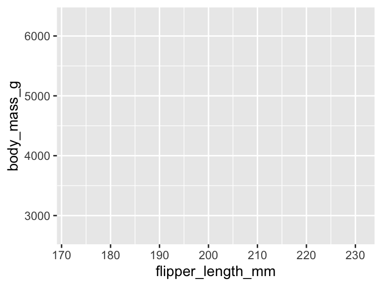
ggplot() sets up a plot for a data frame — with nothing mapped yet, there’s nothing to draw.
library (tidyverse)library (palmerpenguins)ggplot (data = penguins)
Geometries: add a mapping
aes() maps columns to axes. This sets up the grid, but still no geometry has been added.
ggplot (data = penguins,mapping = aes (x = flipper_length_mm, y = body_mass_g)
Geometries: add a geometry
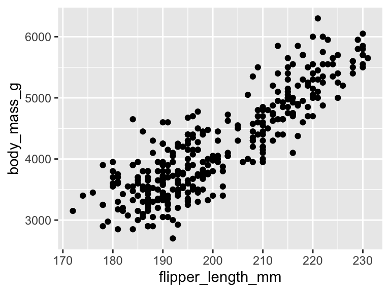
A geom_*() layer draws the mapped data. geom_point() draws one point per row.
ggplot (data = penguins,mapping = aes (x = flipper_length_mm, y = body_mass_g)+ geom_point ()
Geometries: choosing a geometry
The geometry you choose depends on the kind of relationship you want to show.
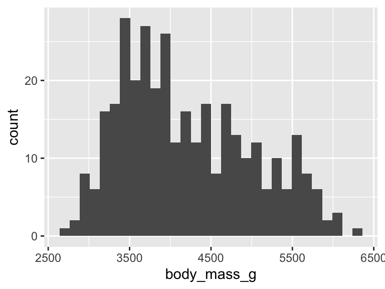
One numeric variable → geom_histogram()
ggplot (penguins, aes (x = body_mass_g)) + geom_histogram ()
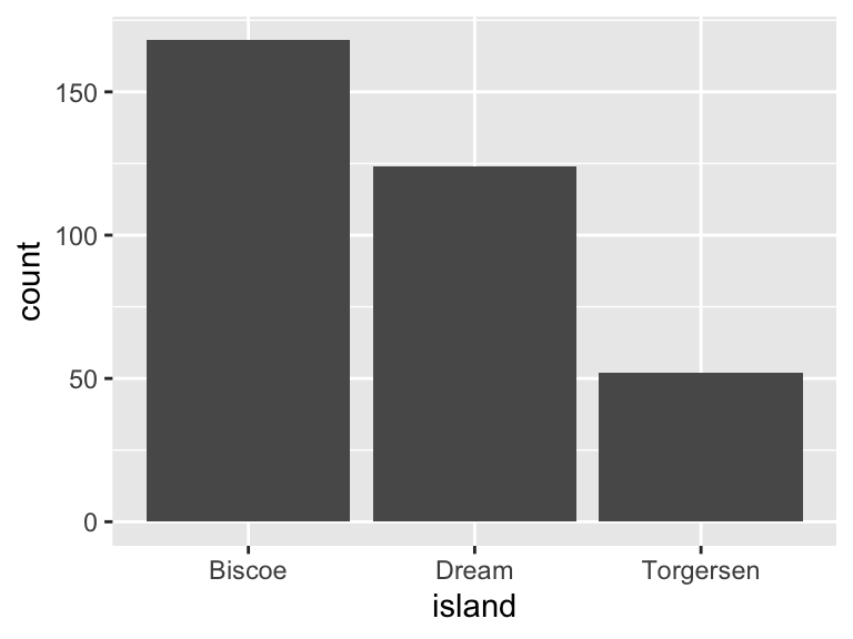
One categorical variable → geom_bar()
ggplot (penguins, aes (x = island)) + geom_bar ()
Geometries: comparing groups
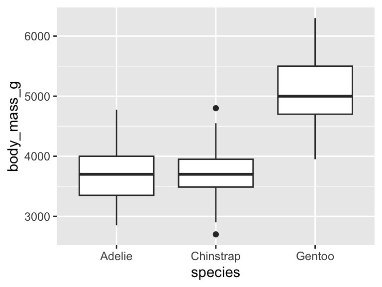
A numeric variable by a categorical variable → geom_boxplot() shows the distribution within each group.
ggplot (data = penguins,mapping = aes (x = species, y = body_mass_g)+ geom_boxplot ()
Aesthetics
aes() isn’t just for x and y — it can map columns to other visual properties too.
x, y — positioncolor — outline / line colorfill — interior colorshape — point symbol
Aesthetics: color vs. fill
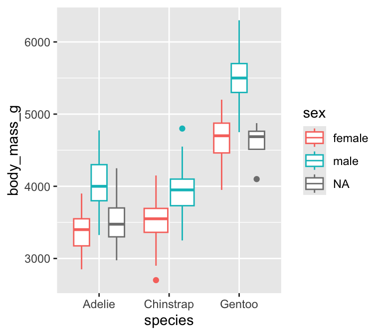
color — outlines
ggplot (aes (x = species, y = body_mass_g, color = sex)+ geom_boxplot ()
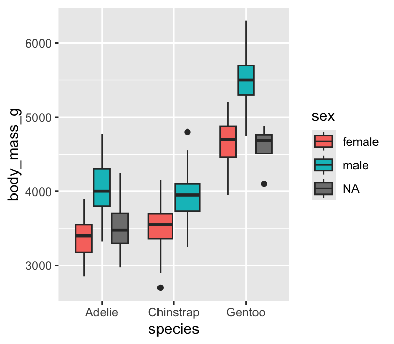
fill — interiors
ggplot (aes (x = species, y = body_mass_g, fill = sex)+ geom_boxplot ()
Aesthetics: shape
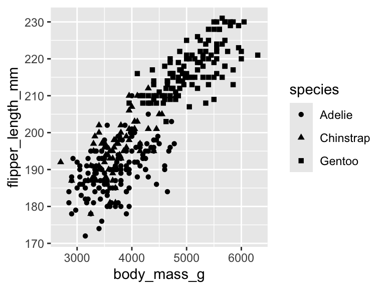
shape gives each category of a point geometry a different symbol — useful when color alone isn’t enough (e.g., grayscale printing).
ggplot (data = penguins,mapping = aes (x = body_mass_g, y = flipper_length_mm, shape = species)+ geom_point ()
Aesthetics: combining color and shape
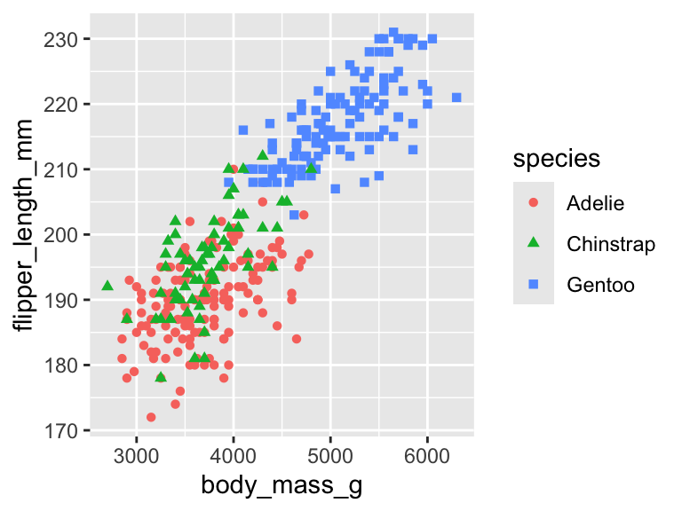
Mapping species to both shape and color encodes the same grouping two ways, making it easier to read.
ggplot (data = penguins,mapping = aes (x = body_mass_g,y = flipper_length_mm,shape = species,color = species+ geom_point ()
Scales
Every mapped aesthetic has a scale controlling how data values become visuals — an axis, a legend, a color ramp. scale_*() functions let you customize them: titles, breaks, and the values themselves.
Scales: renaming and rebreaking axes
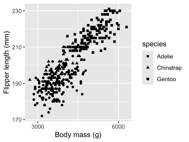
scale_x_continuous() and scale_y_continuous() control the x- and y-axis scales — here, a cleaner title and fewer tick marks (n.breaks).
ggplot (data = penguins,mapping = aes (x = body_mass_g, y = flipper_length_mm, shape = species)+ geom_point () + scale_x_continuous (name = "Body mass (g)" , n.breaks = 2 ) + scale_y_continuous (name = "Flipper length (mm)" , n.breaks = 4 )
Scales: choosing values manually
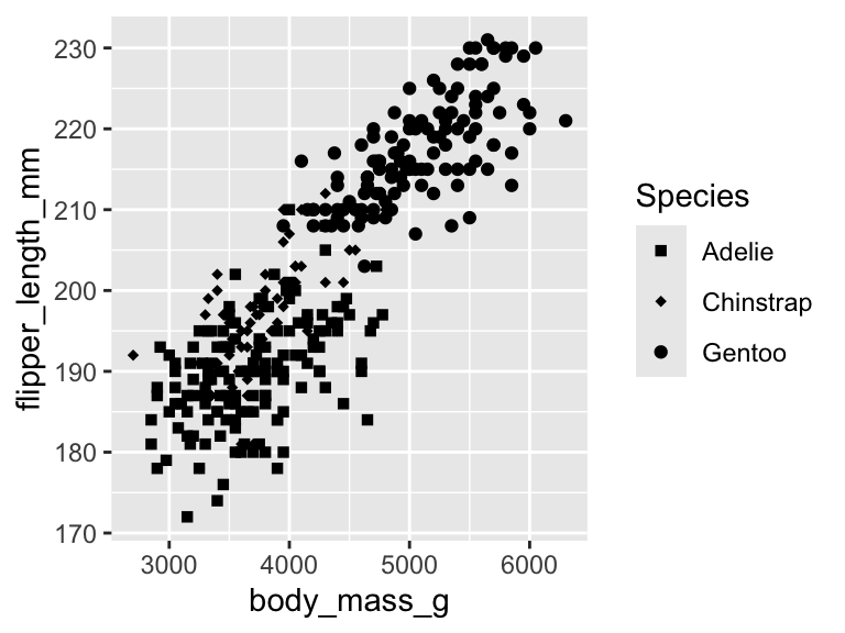
scale_shape_manual() lets you assign the exact shape (or color, or fill) for each category, instead of accepting the default.
ggplot (data = penguins,mapping = aes (x = body_mass_g, y = flipper_length_mm, shape = species)+ geom_point () + scale_shape_manual (name = "Species" ,values = c (Adelie = "square" , Chinstrap = "diamond" , Gentoo = "circle" )
The grammar of graphics
ggplot2 builds a figure by layering independent pieces on top of each other, instead of picking one big “chart type.”
data
The data frame you’re plotting.
mapping
Which columns control which visual properties (aes()).
geometry
The shape used to represent the data (geom_*()).
scale
How the mapping shows up on the figure (scale_*()).